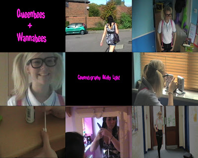
In the First screen-grab we are demonstrating The Title of the film. The Title helps to show the genre of our film, as the fun and young type of text which would appeal to the viewers. The title is not very conventional as it is in its own shot and not over the top of the film clip. However this makes it clear of what the title is saying and gives it a school like effect. The font of the title is 'Shake that Booty'.
The setting and location screen-grab is an example of one of the 4 locations that we shot in. The shot we have used is in a walking scene and is supposedly located outside the characters house. Its quite conventional as it shows the character walking to school and leaving the house, it would appeal to our target audience as it is the sort of day to day routine they would carry out.
The Costumes and Props department is one of the strongest aspects, in our film in our opinion. The screen-grab shows the 'Geek' stereotype in her costume. We decided to go over the top with the geek costume and props to highlight the comical effect in the film. The Big glasses and bag demonstrate this. The 'Fake' character shows the strong contrast between the 2 characters and is also over the top by wearing a dress and heels to school. The outfits could be seen as conventional in the comical sense, but not in the typical school uniform sense.
The 4th shot is camera work and editing. The shot we are showing is the zoom. This is the transition between the geek and fake character. Throughout the film we use fades to make the opening flow more easily and it looks better as it highlights the comparison more between the characters. We also tried to make the shots at an equal time to make the opening have a better level of consistency. We also used a wide range of shots to vary the opening. For example we used long shots to show the background, mid shots to show the character, and we mainly used close ups to highlight certain aspects of the shot.
We used the Font 'Shake that Booty'. Throughout the opening we used the same font and colour to keep a equal level of professionalism and consistency. We also think that the font really fits in with the genre of our film. The font is almost like 'Bubble writing' which links to a school type of genre and therefore links to the characters and our target audience.
The opening shot in our film is of the Geek turning on the radio. However it now seems a bit out of place and unnecessary due to misunderstandings in class. We were led to believe that if music was looked to be playing through a radio or ipod etc.. we were able to use it and it wouldn't be seen as copyright. However this was not possible, and we overcome this problem at the last minute by creating or own soundtrack on garageband. However not as good as our original which linked to the story line and the characters we think its fine. The original soundtrack was Taylor Swifts 'You Belong With Me' which really linked to our story-line and helped to explain our story in more detail as the lyrics were related to our characters, e.g. the way they are dressed. e.g.. 'she wears short skirts i wear t-shirts'.
The opening of the film highlights the genre at hand, in which is comical. This is shown throughout the opening, which is brought in with the character `Geek`, this is as the costume gives a comical effect as it is over done with the huge framed glasses and the braces. We then introduced the shakiness of the camera to make it feel like its real life and also give its a comic feeling as it is seen as amateur. Another comic factor we brought in was the contrast of the character e.g. the `Geek` smelling herself but in contrast the `Fake` sprays herself with perfume, this makes the audience find this comical as the contrast is blatant.
The characters in our film openings are introduced through mirrors, this is to represent how the two see themselves. we did a transition of zoom in which the zoom starts from one character to the other, in which again shows the huge contrast of the two. We thought this worked well as we could introduce the two characters at the same point in the film opening. Also as the characters are introduced at the same time it shows a bigger contrast as it is immediate. We think this type of introduction to the characters is original and unique and therefore isn't a strong convention.
In the last screen grab it shows one of our transitions, fading out. This an effect we used to make the flow of the scenes more natural and easy. The shot also shows from that point onwards a good example of continuity editing as the shots from then onwards flow really well and use the skills we learnt in our preliminary task. Throughout the opening we think we had a strong sense of good continuity editing as the scenes all flowed well.
No comments:
Post a Comment