Friday 13 November 2009

Task 1: In what ways does your media product use, develop or challenge forms and conventions of real media products? (i.e. of film openings)


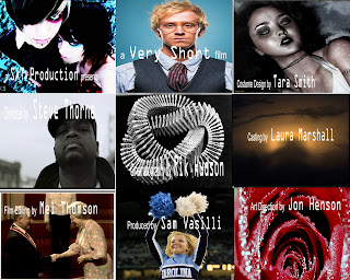
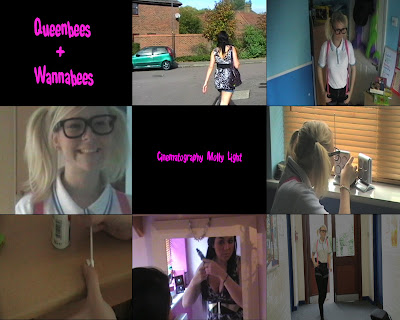
In the First screen-grab we are demonstrating The Title of the film. The Title helps to show the genre of our film, as the fun and young type of text which would appeal to the viewers. The title is not very conventional as it is in its own shot and not over the top of the film clip. However this makes it clear of what the title is saying and gives it a school like effect.   The font of the title is 'Shake that Booty'. 

The setting and location screen-grab is an example of one of the 4 locations that we shot in. The shot we have used is in a walking scene and is  supposedly located outside the characters house. Its quite conventional as it shows the character walking to school and leaving the house, it would appeal to our target audience as it is the sort of day to day routine they would carry out. 

The Costumes and Props department is one of the strongest aspects,  in our film in our opinion. The screen-grab shows the 'Geek' stereotype in her costume. We decided to go over the top with the geek costume and props to highlight the comical effect  in the film. The Big glasses and bag demonstrate this. The 'Fake' character shows the strong contrast between the 2 characters and is also over the top by wearing a dress and heels to school.  The outfits could be seen as conventional in the comical sense, but not in the typical school uniform sense. 

The 4th shot is camera work and editing.  The shot we are showing is the zoom. This is the transition between the geek and fake character. Throughout the film we use fades to make the opening flow more easily and it looks better as it highlights the comparison more between the characters. We also tried to make the shots at an equal time to make the opening have a better level of consistency. We also used a wide range of shots to vary the opening. For example we used long shots to show the background, mid shots to show the character, and we mainly used close ups to highlight certain aspects of the shot. 

We used the Font 'Shake that Booty'. Throughout the opening we used the same font and colour to keep a equal level of professionalism and consistency. We also think that the font really fits in with the genre of our film. The font is almost like 'Bubble writing' which links to a school type of genre and therefore links to the characters and our target audience. 

The opening shot in our film is of the Geek turning on the radio. However it now seems a bit out of place and unnecessary due to misunderstandings in class. We were led to believe that if music was looked to be playing through a radio or ipod etc.. we were able to use it and it wouldn't be seen as copyright. However this was not possible, and we overcome this problem at the last minute by creating or own soundtrack on garageband. However not as good as our original which linked to the story line and the characters we think its fine. The original soundtrack was Taylor Swifts 'You Belong With Me' which really linked to our story-line and helped to explain our story in more detail as the lyrics were related to our characters, e.g. the way they are dressed. e.g.. 'she wears short skirts i wear t-shirts'.

The opening of the film  highlights the genre at hand, in which is comical. This is shown throughout the opening, which is brought in with the character `Geek`, this is as the costume gives a comical effect as it is over done with the huge framed glasses and the braces. We then introduced the shakiness of the camera to make it feel like its real life and also give its a comic feeling as it is seen as amateur. Another comic factor we brought in was the contrast of the character e.g. the `Geek` smelling herself but in contrast the `Fake` sprays herself with perfume, this makes the audience find this comical as the contrast is blatant. 

The characters in our film openings are introduced through mirrors, this is to represent how the two see themselves. we did a transition of zoom in which the zoom starts from one character to the other, in which again shows the huge contrast of the two. We thought this worked well as we could introduce the two characters at the same point in the film opening. Also as the characters are introduced at the same time it shows a bigger contrast as it is immediate. We think this type of introduction to the characters is original and unique and therefore isn't a strong convention.

In the last screen grab it shows one of our transitions, fading out. This an effect we used to make the flow of the scenes more natural and easy. The shot also shows from that point onwards a good example of continuity editing as the shots from then onwards flow really well and use the skills we learnt in our preliminary task. Throughout the opening we think we had a strong sense of good continuity editing as the scenes all flowed well. 

Task 2: How does your media product represent particular social groups?
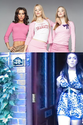


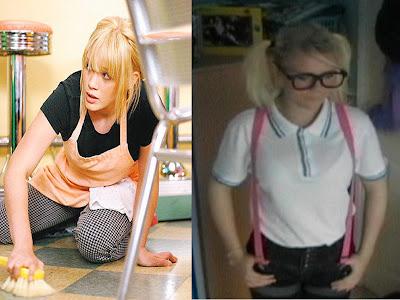
The character we decided to look at was the "Fake". We have compared her to the "Plastics" in the film 'Mean Girls' The similarities the characters have are the way in which they dress , for example in these images all characters are dressed in short skirts and caked in makeup, giving of the impression of 'Plastic'.  However in this shot due to fading and lighting you can not see the extent of makeup our character is wearing. 
All characters also have similar roles in the films, they pick on people who are vulnerable and they set all the trend, However no one really likes them they just scare people into liking them. 

Below also is an example of the geek character and a similar character to her from the film `A Cinderella Story`. 


Task 3 What kind of media institution might distribute your media product and why?

What does a Production Company do?
-Its a company responsible for the development and production of films/radio/preforming arts/TV etc..
- They are sometimes directly responsible for the funding for the production.
- In America they sometimes sell their products to the film studios.

Where does the Money come from?
-The money is sometimes funded by the production Company.
If the film is an independent one the film is sponsored. The 2 options for our film are: The UK film councils print and advertising fund, which is best suited for more low budget films like ours, or, the film could have been entered in a microwave challenge, these are backed by the BBC and the contestants are given and £100,000 budget. Our film could have been the winner.

Idea of a Distributer?
-Paramount Pictures: These are a well known label and have been used with films such as Mean Girls; Angus Thongs and Perfect Snogging etc..
-They are well known and reliable and work with films similar to ours.

Titles?
-The main characters names appear on the screen when the opening shots of the characters appear, to show who the actors are playing.
-Other names like Costume Design appear after or before shots where costume is highlighted.
-The directors and producers names are at the end of the sequence to show that they oversee everything in the film.

What Film is similar to it institutionally?
-Mean Girls
-Angus, Thongs and Perfect Snogging These are all based in schools and the
-St Trinians people are around the same age group.
-Wild Child

-Beauty & the Geek (TV) Show comparison
-Beauty and the Beast (disney)

-House Bunny- Fake Character
-A Cinderella Story- Geek Character

-Fish Tank This is an independent film like ours, and if our film didn't have the comedy sense to it then it would be quite similar due to the bullying where there could of been violence in the film.


Task 4: Who would be the audience for your media product?


These are the type of people who would like to see our film.
They are between the ages of 13 and 19.
They could be Boys or Girls, but most likely Girls.
They spend their spare time hanging out with their friends, going to partys, going shopping, and watching films :)
They are in full time education.
They listen to all types of music, but mainly mainstream music such as the top40 :)
They dress in Topshop/Topman, River Island, Primark and H&M.
They watch Hollyoaks, Big Brother, Skins, The Hills etc..
The girls enjoy sleepovers with their friends and the boys like playing football :)
Thay spend their money on nights out with their friends or boyfriend/girlfriend and going to the cinema etc..
The main types of films they watch are teenage films as they can relate to them they also watch horror films and comedys :)

Task 5: How did you attract/address your audience?


Above is the annotated version of our film with annotations linking to similar films or websites etc our target audience would be interested in, such as topshop and sugar.

Task 6: use of technology.
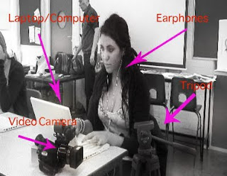


Above is a annotated picture of Hannah using the equipment we used to shoot our video. We only used the basic materials as we didnt require the more advanced equipment and no extras.
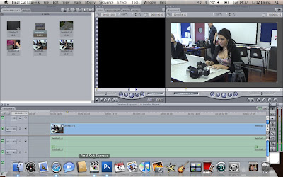

Above is a screenshot of us using final cut, this was used to edit our movie.


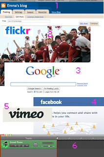
Above is a photo of all the websites i used to make my video.

1. Blogger, This was used to upload all of our pre planning.
2.Flickr, We uploaded our timelines etc..
3.Google, we found images and sites from this.
4. Facebook, We got inspiration and images for pre planning from this.
5. Vimeo, All of our videos were uploaded here.
6.Garageband, where all of our soundtracks were edited/made.

To help edit the soundtrack and for a tutorial as well.

Task 7: Looking back at our preliminary task, what do you feel you have learnt.

This is an example of where we used The Continuity Rule.


Looking back at our preliminary task and now looking at our final project, you can see how much we have progressed especially in editing. We can tell that we have defiantly improved on the match on action rule, this is where you join clips together to make one scene. We can see a difference in how we edited our preliminary to our film opening, this is as some of our scenes were cut to early and didn't have transitions to let the shots run through smoothly and not suddenly jump from one scene to another.

However unlike in the preliminary task we did not use the shot/reverse rule, this is as we felt it was not necessary as we didn't really have two characters in each clip at once. We did not have more than one character in each scene as we decided that if we did the contrast wouldn't be as clear, and it would have defeated the whole point of our film opening. This is because our film opening is all about introduction the two main characters and there differences, so it would not have worked well using this rule.


We also use the continuity rule in both task, you can see we learnt from the preliminary task as the rule worked really well in our film opening with no sighted faults. Also in the preliminarytask you can see that the continuity rule was not as successful as it jolts and doesn't really fit in with scene before.

Film Categorization.


I think that our film should be classified as a 12A.


The A stands for 'accompanied' and 'advisory'. '12A' means that anyone aged 12 or over can go and see the film unaccompanied. Children younger than 12 may see the film if they are accompanied by an adult (eg someone over the age of 18), who must watch the film with them.
The content of '12A' rated films is suitable for children aged 12 and over, but i would not recommend taking young children to see them. The films may upset children under 12 or contain material which many parents will find unsuitable for them. An adult may take a younger child if, in their opinion, the film is suitable for their child. responsibility for allowing a child under 12 to watch the film at hand is up to the accompanying adult.

A quote from the BBFC concerning the age guidelines for a 12A: "the BBFC considers the content of '12A' rated films to be suitable for children aged 12 and over, and we would not recommend taking very young children to see them."

Their may be language used in the film but it must be infrequent and mild. The BBFC said :"The BBFC's Guidelines state that there may be strong language (eg 'f***') at ‘12’ or ‘12A’, but it must be infrequent."

Moderate violence can be seen in the film but, "it should not dwell on detail. There should be no emphasis on injuries or blood, but occasional gory moments may be permitted if they can be justified by their context (for example brief sight of bloody injury in a medical drama)."


Wednesday 4 November 2009

Creative Risks.

The creative risks that our group took for our film opening are the style of our opening. 
Our film is comical and it is a creative risk as our audience may not agree with our style of comedy and it could seem offensive to people who we base our characters on. 
This could cost us because it could make our footage come across as offensive to some viewers. The Benefit of the creative risk we took is that the comedy comes across as funny to most viewers and therefore benefits us.  

Sunday 1 November 2009

Liam & Tom, Feedback.

L3 - GROUP 3 (Tom & Liam) Fim Opening Rough Cut from cmdiploma on Vimeo.


Above is Tom & Liams rough cut for their film opening.
So far i think that this looks like a really promising film opening, but there is still things that need to be put in. For example you still need to add titles to your opening. I think you need to make it more clear what the story is acctually about, because from an outsiders point of view it doesnt seem to have much meaning.
I also am not really sure what the audio is at the beginning of the opening,
but whatever it is it needs to be clearer as this could contribute a lot to the opening. I also think you should vary your shots a little more as there seems to be a lot of walking in long shot frames which can seem a little boring. Overall this seems like a good start to your film opening and with a few changes it is sure to be very good :)

Our Rough Cut

L3 - GROUP 2 (Hannah & Emma) Film Opening Rough Cut from cmdiploma on Vimeo.


This is mine and hannahs rough cut for our film opening.
We need to still edit most of our shots as at the moment they just cut to the next shot whereas we intend to have fades etc in our shots.
We also need to add titles, me and hannah have a plan of where our titles are going and what font we are using etc..so this should not be that difficult.
So far i think our rough cut has come out good, the shaky effect in our filming is deliberate and makes it look more like real life.
I think that the humour in our opening is really good, and adds a sense of comedy to our film.

Sunday 18 October 2009

A similar film opening to ours :)

Our film opening is called "QueenBees & WannaBees"
Its target audience is young teenage girls who still attent school/college.
We based our film on the music video "You Belong With Me" By Taylor Swift. We have posted the music video in a previous post.
Some films you could compare ours to are: Mean Girls; St Trinians; House Bunny etc.
These films all show examples of sterotypes and contrast them like our film does, they also are set in either School/College/ Uni settings.
Below is the trailer to the film Mean Girls.


The film shows different stereotypes and shows the way school life is, and "Girl World"
Like our film it contrasts the different sorts of students and personalities you can find around a school.

Our Film Opening so Far....

On friday me and hannah were able to film most of our film opening. We carried out a lot of our footage at home (Bishops Stortford) as we had to shoot in a house. we now only have a few shots left to shoot and we hope to do these on tuesday morning. Unfortunatly we do not have any pictures of clips from our work so far as it has not yet been uploaded.

Sunday 11 October 2009

animatic video.

L3 Group 2: HANNAH & EMMA - OPENING SEQUENCE ANIMATIC from cmdiploma on Vimeo.

Storyboard Session. :)


These are some pictures from the storyboard session. Above are some pictures of our timeline, storyboards, and some pictures of me and hannah doing work :)


Feedback

Good work on the task emma

Thursday 8 October 2009

Art of Title Sequence.


The title sequence i chose to do was Catch Me if You Can.


Also above are are the pictures of the timeline i done for the title sequence. Unfortunatly the pictures are slightly blurry, so i done close up shots also.


My ident final.

L3 EMMA-IDENT_FINAL from cmdiploma on Vimeo.ed

I created my ident using final cut and photoshop. I firstly came up with the name for it, "Electric Productions" I then searched for images that could relate to that name. I thought the heart i chose gave an almost static look to the image which i thought went really well with the name. I decided on a black background so as the heart would stand out more and look more dramatic.

I then had to decide on a text that would also highlight the name ans show the connection. The text i used looks very static also and is very unique. I thought this would be good so as a viewer you can always identify the text with the brand.

I then added effects to the video which made the heart flicker like an electric shock. This gave a really strong impact to the video and gave it some edge. I then done the same to the writing which made it look like lightning. I done these effects using the pen tool, by increasing and decreasing the settings on the images and text.

I then finally added some audio. I used garage band to do this. It was quite easy to do this as i simply just went to the Electronic sounds which gave me a big variation of sounds. I chose my one as its very unigue and i think it would be remembered and liked by young and old.

Tuesday 6 October 2009

Mind Frames.

Below is a set of frames me and hannah created for a possible opening title sequence. We decided to use random pictures to see how different things work such as font on texts, etc. As you can see below some pictures are more effective than others. for example the last shot really stands out as the font and text stands out on the background. Whereas on the 5th shot the text is difficult to read as the colours are hard to see.

Film Pitch :)

Our Film will be a 'Chick-Flick' which target audience will be 13-18 year olds. It will be an independent film with a low budget.
Our film will have two different stereotypes, a "Geek" and a "Fake"
The opening sequence will show the two characters getting ready for school which will highlight the strong contrast in the two characters. 
We based a lot of our ideas on the music video 'You Belong With Me' By Taylor Swift. 


Other films that are similar to our film opening are: Mean Girls; St Trinians; Wild Child; etc..
A film opening i find quite similar to ours is the opening to Legally Blonde with the scene showing Elle (Reese Witherspoon) geting ready. The shots used are quite similar to ours and i based a lot of our ideas on this type of filming. Below is the link to the film opening.


Monday 5 October 2009

Logo.


Above is my logo image for my film opening. The word electric links to the static like look of the heart which in the clip will flash along like an electric shock.

Credits for opening sequence

A Electric Production presents
A See Big Production film

(cast) Harry Wright
(cast) Lucy Mead
(cast) Josh Murr

Costume Design by Mellissa Taglarinni
Art Direction by David Watts
Production Design by Becky Davy
Casting by Heidi Porter
Film Editing by Katie Hyne
Cinematography by Sadie Marsh
Original Music by Jack Robarts
Produced by Emma Smart
Directed by Hannah Amin

Main Title

Sunday 4 October 2009

feedback

some good ideas but can you embed the video rather than just paste a link?

Friday 2 October 2009

Mood Board - text


These are our possible Fonts for our titles. We think they represent different stereotypes well.
 

Mood Board


This is our moodboard for our film opening. We wanted to show the two stereotypes of 'Geeks' and 'Fakes'.

Thursday 1 October 2009

My Short Film Pitches

Action - An all action epic. Suicidle Jeff Hughs is spoken to by the devil and is given all his powers and asked to destroy the world, however on the otherside of the world local man Simon Andrews is spoken to by god and given all his powers. Its the ultimate battle of the Gods, Who will conquer all!?

Supernatural Thriller - A Mother and her Baby girl are living in a desolate Village, with the Husband away on business, Freaky things start happening, Friends are being killed and spooky messages are posted throught the door, could this be a turn for the worst for this idilic village?

Independant - Set in Italy a rich woman falls in love with the local peasant, after a fling their familys find out. Will these too such different people ever be together?

Adult Animation - A mans story of his life. Ben Johnson is a paranoid schizofrenic who becomes a serial killer,unknowingly leaving himself clues behind him, leading him to be discovered!

Continuity Task


This week we had a continuity task. We had to make a short clip to demontrate the rules of this. Below is our final product.


Continuity editing is when everything os smoothed over to give a film/shot a more even flow and to make the shots look more natural.

180 degree rule is when the camera can only go on one side of an 180 degree axis so as not to distort the clip as it could make the shot look un real.

Match on Action Rule is when you have to connect 2 different shots in a precise amount of time, eg Shot 1- Someone walking towards a door Shot 2- Close up of hand on door handle.

Shot/Reverse Shot - This shows 2 characters conversation using alteration of shots over each others shoulder, showing who is speaking/who is being spoken to.

Overal i think me and Hannah did a good job of editing our clip. However at the beginning there was a bit of audio that wasnt suposed to be there and also sometimes i think we cut the clips too short which led to speach being cut out and to shots being to abrupt.

Monday 28 September 2009

Feedback

Good points but needs to be more detailed. You needed screengrabs for Juno as well. can you embed the clip from the film? have another go at editing the post.

Case Study of a Film Opening.

The Film opening i will be looking at is Love actually.
This is one of my favourite films of all time and i think that the opening scene actually has a hidden meaning.
The scene starts with someone walking through the airport and on the screen apears,"Universal Pictures and Studiocanal Present"
This then fades out and "A working title Production" appears. This also fades out and "In Association with DNA films" comes onto screen.
You then have about 3 shots of people greeting each other at the airport , Mothers and daughters, Husbands and Wives etc..before hugh grant begins his voice over.
His voice over explains how he feels that everyone at airports come to greet each other with love, he then also comments on the twin towers and how all the messages left were ones of love and not hate. As the voice over is going on you see several shots of relatives and friends greeting each other with hapiness at the airport which relates to what Hugh Grant is saying.
Over all of the clip is a very slow, almost harmonic music which gives a romantic feel to the scene.
This carries on till about 1:02 when the words come up "love actually" in white, then "is" in red and then "all around" in white, this comes up at the same time Hugh Grant says it.
You then see a clip of a group of relatives hugging and the words "is all around" fade out, and the word love changes to the colour red to emphasise the meaning of what Hugh Grant is saying.
The background picture of the family then fades out to leave, on a black background, Love Actually.

Below is the link to the Love Actually opening scene;
http://www.youtube.com/watch?v=PMScPVO4rLw

Juno


This is our remake of the film opening juno. Our group decided to split the roles in the film equally so that we had a go at doing everything.
we used the tripod a lot during filming to make the filming less shaky and more professional. We used props to make the filming better quality.
Although i wasn't there i think the editing was really well done and that it made it look how juno does in the beginning. I also think we made it as similar to juno as possible by getting most of the shots and making it look real.
Sometimes during the filming i think that the shots were not flowing well enough as each tie there was a new shot it just cut to it straight away with no effects.
A difficult part of filming was trying to get all the shots in and in the right frames and looking as good as the original.
I think sometimes during the filming we were not prepared enough to shoot all the shots like not having the right props. next time we should be more prepared.

Monday 21 September 2009

Feedback

Very good detail on Casino Royale. Well done.

For the post on Shifty, you need to say more about how the moodboard task worked and how it was based on a particular scene and trying to give a sense of atmosphere from that. Later you will be creating moodboards for your own project ideas.

Pete

Sunday 20 September 2009

Student Film Opening.


This Film opening is called R1 18. It is a student film opening.

I enjoyed this film opening becuase i think because it was filmed about people my sort of age that i could, as a teenager, relate to it.
I really thought the two diffrent chararcters were a good point to the film becuase playing them alongside each other really highlighted the differences in the 2 characters and made the differences seem more extreme.
The shots were also very effective as the 2 characters were acting out similar sorts of scenes which again highlighted there differences.
A negative thing i found about this film is that the acting was of poor quality and made the scenes seem unrealistic and were more difficult to watch.

Wednesday 16 September 2009

Casino Royale-Film Opening.


Above is a link to the film opening from Casino Royale. For this weeks homework we have been asked to watch a film opening and say what we find interesting about it and why. Being a generaly 'chick-flick' sort of girl it was nice to see a different genre of film that i really enjoyed. The scene is a frantic chase involving two characters. The camera at the start if the scene moved with the crowds and the characters to give an impact of what it was like to be there. It really made me, as a viewer, interested and hooked. Another Camera technique used was the 'Helicopter Shot'. When used during dramatic moments it gave a real sense of how the whole scene was unfolding and the Huge impact things were having on surroundings and people in the scene. They also used slow motion during dramatic stunts to make it more tense and to give a dramatic impact to the film. A camera technique they used that i found very effective was how they sometimes shot through the characters eyes, to give a real sense of what was actually happening.
The sets constantly were changing to give the impact of the pace the characters were running and it also gave the viewers the idea of the size of this chase.
Constantly through the film were stunts preformed by both actors, which keeps the vieweer hooked by the almost 'unrealistic' effect although it was very convincing.
The music used throughout the scene was constantly building up suspense and drama and almost symbolised the characters emotions at that point in time.
Although you are never told during the scene which character was 'good' and which was 'bad' it was fairly obvious due to discreet things added in. What gave me the idea of knowing which character was bad was when during the beggining of the scene when there was a snake on the ground which the character jumped over, i thought that as snakes represent danger and evil that character would be identified as 'bad'.
The good character, however, was identified by the characters inabilty to do stunts as well as the other character. This therefore fits into the sterotype of good conquering evil.

Cityscape Video.

On Tuesday Pete gave us a task to creative a film opening from a series of short video clips with a backing track using Final Cut. We had to edit the shots the music and learned skills like making the shots fade in and out, and input text over the clips. Below is the short clip we made.

Tuesday 15 September 2009

Moodboard

I made two moodboards on Friday each one represented the different sides of drugs and the effects they have on people. The first one shows the good effects and the second the bad effects. In the first one it shows the kind of 'Party Lifestyle' that someone who takes drugs leads. In the second one we concentrated on the eyes as its well known that drugs take immediate effect on the eyes and their appearence.

The moodboards were based on a particular scene from the film shifty. In the scene you could really sense the atmosphere and i think this comes across in the moodboards.
Thursday 10 September 2009